 |
 |
 |
 |
 |
 |
| |
 |
|
 |
 |
 |
  |
  |
 |
 |
 |
 |
|
|
 |
|
 |
 |
 |
BUILDING |
 |
|
 |
|
 |
 |
 |
| |
 |
| 
 |
The Exchange
|
|
 |
 |
 |
 |
DESIGNER |
 |
|
|
 |
|
 |
 |
 |
| |
 |
|
 |
 |
 |
 |
CONTEXT |
 |
|
|
 |
|
 |
 |
 |
| Location |
 |
|
 |
 Surrounded by water and framed by mountains, the unique urban cityscape of Vancouver’s downtown is defined by its spectacular natural setting. ‘The Exchange’ is located in the heart of this downtown area. Selected by the city officials as one of a few new, high density, office developments in the city’s central business district this new tower will bring valuable diversity, revenue and jobs to the neighborhood and to the city as a whole. Surrounded by water and framed by mountains, the unique urban cityscape of Vancouver’s downtown is defined by its spectacular natural setting. ‘The Exchange’ is located in the heart of this downtown area. Selected by the city officials as one of a few new, high density, office developments in the city’s central business district this new tower will bring valuable diversity, revenue and jobs to the neighborhood and to the city as a whole. |
|
 |
 |
 |
|
 |
|
| Relationship with the location |
 |
|
 |
|
 |
 |
 |
 |
 |
 |
 |
DESCRIPTION |
 |
|
|
 |
|
 |
 |
 |
| . |
 |
|
 |
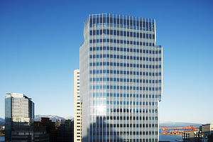
 The design rationale for the new ‘Exchange’ tower is entirely derived from its surrounding context and environment; in particular the existing Old Stock Exchange building, which is to be preserved and rehabilitated on the site. This refined, handsome and elegant building has facades of carefully composed vertical pilasters that are designed both to best accentuate its height and at the same time ground the building within the streetscape of the city. The design rationale for the new ‘Exchange’ tower is entirely derived from its surrounding context and environment; in particular the existing Old Stock Exchange building, which is to be preserved and rehabilitated on the site. This refined, handsome and elegant building has facades of carefully composed vertical pilasters that are designed both to best accentuate its height and at the same time ground the building within the streetscape of the city.
 The new tower blends in an establishes a dialogue with this prominent original building in order to create an overall composition that looks at once to Vancouver’s future without obscuring its past. The new tower blends in an establishes a dialogue with this prominent original building in order to create an overall composition that looks at once to Vancouver’s future without obscuring its past.
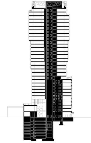
By both breaking up the mass of the tower over its entire height and by recessing its bulk from the perimeter of the site above the Old Stock Exchange, the new building allows the existing structure to fully define the streetscape, retaining and confirming its proud position within the heart of Vancouver’s downtown.
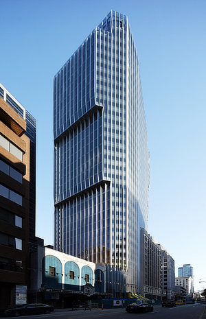
As the form of the tower retreats lower down to better define the original form and independence of the Old Stock Exchange, it consequently grows higher above to maximize its potential on the site. Here at the upper, more valuable floor levels, the tower steps out in two directions to provide larger, more efficient floor plates. These steps consequently create terraces on the tower’s sides that are optimally positioned to exploit the best views of the surrounding city and the dramatic panorama of the mountains beyond.
The stratification and stepping of the tower’s form, coupled with the chamfering of its corners both reduces its overall bulk and impact on its neighbors and leaves the Old Stock Exchange building as the single-largest element on the site, emphasizing its presence within the city center.
Restricted by viewing corridors from creating a strong intervention on the skyline, ‘The Exchange’ instead looks to create a distinctive icon within the space of the city itself. Viewed from the street, its cantilevered form creates a unique identity further pronouncing its individuality and historical pedigree.
A respect for the architectural and significant socioeconomic heritage of this original building is also paramount to the origins and identity of the tower’s façade design. The strongly vertical nature of the Old Stock Exchange’s façade is echoed in the elegant pinstripe of the tower’s external aluminum mullions. This unified system responds to the solid pilasters of the Old Stock Exchange Building that is to be retained on the site whilst accentuating the verticality of the tower itself, defining a more uniform and slimmer overall appearance of the building from all orientations.
The vertical mullions perform a further function, shading the building envelope and significantly reducing its cooling load requirements. Their passive screening effect also greatly improves the visual privacy between the tower and its immediate residential neighbor, Jameson House.
The project was designed in collaboration with Iredale Group Architecture commissioned by Swissreal and Credit Suisse Real Estate Fund International. MKT Arkle Development Management Inc. acted as project managers and PCL Constructors Inc. as general contractor. |
|
 |
 |
 |
|
 |
|
| . |
 |
|
 |
|
 |
 |
 |
 |
 |
 |
 |
POINTS OF VIEW |
 |
|
|
 |
|
 |
 |
 |
| |
 |
|
 |
 |
 |
 |
VIDEO |
 |
|
|
 |
|
 |
 |
 |
| |
 |
|
 |
 |
 |
 |
ECO-SUSTAINABILITY |
 |
|
|
 |
|
 |
 |
 |
|
|
 |
| ‘The Exchange’ opened in 2017, will be the first LEED Platinum Heritage Conversion in Canada. |
|
 |
 |
 |
 |
 |
 |
 |
LOCATION |
 |
|
|
 |
|
 |
 |
 |

|
 |

|
Continent |
|
 |
  North America |
|
Nation |
|
 |
  Canada |
|
Province |
|
 |
  British Columbia |
|
Regional district |
|
 |
  Greater Vancouver |
|
Town |
|
 |
  Vancouver |
|
Address |
|
 |
  475 Howe Street
|
|
|
|
 |
|
Website |
|
 |
|
 |
 |
 |
 |
MAP |
 |
|
|
 |
|
 |
 |
 |
| |
 |
|
 |
 |
 |
 |
|
TYPOLOGY |
 |
|
|
 |
|
 |
 |
 |
Main |
 |
|
 |
ARCHITECTURE | Buildings for offices and professional practises
Offices
Vertical architectures
Skyscrapers
| |
|
|
 |
|
Additional |
 |
|
 |
ARCHITECTURE | Buildings for travel and tourism
Hotels
Operations on existing buildings
Renovation, rehabilitation and restructuring
Extension, superelevation
| |
 |
 |
 |
 |
CHRONOLOGY |
 |
|
|
 |
|
 |
 |
 |
Project |
 |
|
 |
| 
 |
2011 - 2013
|
|
Realisation |
 |
|
 |
| 
 |
2014 - 2017 |
|
 |
 |
 |
 |
AWARDS |
 |
|
|
 |
|
 |
 |
 |
| 2017 |
 |
|
 |
American Architecture Prize
Heritage Architecture |
|
 |
 |
 |
 |
 |
 |
 |
ADDITIONS AND DIGRESSIONS |
 |
|
|
 |
|
 |
 |
 |
| |
 |
|
1929
The old Stock Exchange |
|
 |
 |
 |
 |
 |
 |
 |
CLIENT |
 |
|
|
 |
|
 |
 |
 |
| |
 |
| Credit Suisse Real Estate Fund International / Swissreal |
|
 |
 |
 |
 |
AMOUNT |
 |
|
|
 |
|
 |
 |
 |
| |
 |
|
 |
 |
 |
 |
DIMENSIONAL
DATA |
 |
|
|
 |
|
 |
 |
 |
| Surface |
 |
|
 |
|
| Floors |
 |
|
 |
|
 |
 |
 |
 |
STAFF |
 |
|
|
 |
|
 |
 |
 |
Project  |
 |
|
|
 |
|
Associate designers  |
 |
| Iredale Group Architecture |
|
|
 |
|
Design team |
 |
| José Pedro Azevedo, Severin Berchtold, Wtanya Chanvitan, Alasdair Graham, Harry Gugger, Katja Kleinhert, Korbinian Schneider |
|
 |
 |
 |
 |
CREDITS |
 |
|
|
 |
|
 |
 |
 |
| |
 |
Photos © Credit Suisse | Harry Gugger Studio
Drawings © Harry Gugger Studio
Text edited by Harry Gugger Studio
Courtesy of Harry Gugger Studio | v2com
|
|
 |
  |
 |
|
|